


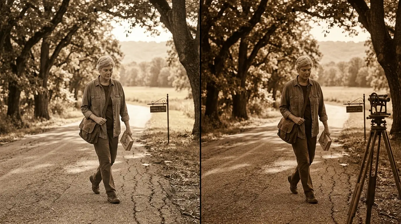
A sepia filter gives digital photos the warm brown appearance associated with older photographic prints. It reduces distracting colors while preserving the image’s light, shadows, shapes, and important details. The result can feel nostalgic without requiring complicated photo-editing skills.
The effect works especially well for portraits, architecture, landscapes, family photographs, and vintage-themed graphics. You can apply it with browser tools, phone apps, or desktop editing software. The key is controlling its strength instead of automatically choosing the strongest setting.
Quick answer: A sepia effect converts or blends a photo toward warm brown and tan tones. Start with a clean image, apply moderate intensity, then adjust contrast and brightness. Use stronger settings for an antique appearance and lighter settings when you want warmth while retaining some original color.
| Quick fact | What to know |
|---|---|
| Main effect | Creates warm brown and tan tones |
| Best for | Portraits, architecture, landscapes, and nostalgic designs |
| Typical workflow | Upload, adjust strength, preview, export |
| Compared with grayscale | Warmer and more nostalgic |
| Strong settings | Create an antique monochrome appearance |
| Light settings | Preserve more original color |
| Helpful adjustments | Contrast, brightness, grain, and vignette |
| Common mistake | Applying too much warmth to an already warm photo |
What Is a Sepia Filter?
A sepia filter is a digital image effect that shifts a photograph toward brown, tan, and warm golden tones. Modern editing software recreates an appearance linked with historic photographic toning. Unlike simple grayscale conversion, the finished image retains a noticeably warm character.
Traditional photographic toning was more than a decorative choice. Chemical processes could convert metallic silver in a developed photograph into silver sulfide. That change created brown coloration and could improve the photograph’s chemical stability.
Digital editing does not reproduce that darkroom chemistry. Software instead changes pixel colors to imitate the visual appearance. Your original digital image can remain unchanged when you save the edited version as a separate file.
Why Does the Effect Make Photos Look Old?
People strongly associate brown monochrome photography with historical portraits and family archives. That visual connection makes warm toning an immediate shortcut for suggesting age. Even a recently captured smartphone picture can feel decades older after careful editing.
Color removal also changes where your eyes focus. Bright modern colors become less prominent, while facial expressions, textures, shapes, and lighting gain more attention. This shift can make a simple photograph feel more deliberate.
The effect alone does not create authentic photographic aging. Real aged prints may include fading, scratches, uneven exposure, paper texture, or physical damage. Those characteristics require separate adjustments when you want a stronger antique style.
How to Apply a Sepia Filter in 3 Steps
You do not need advanced editing experience to create the effect. Most editors follow a similar workflow, even when their controls have different names. Keep an untouched copy of your original before starting.
1. Open or upload your photo. Choose the highest-quality source available. Avoid starting with a heavily compressed screenshot when you have the original image. 2. Apply the warm tone and adjust its strength. Begin around the middle of the available intensity range. Increase or decrease it while watching skin, highlights, and dark areas. 3. Preview and export the finished image. Compare the edited version with the original before saving. Choose an output format that fits your intended use.
For more practical technology walkthroughs, SciTechWiz readers can also explore the site’s How To section. It collects step-by-step guides for everyday digital tasks. Keeping related tutorials together also makes future troubleshooting easier.
How Strong Should the Vintage Tone Be?
There is no single correct intensity for every photograph. A family portrait may benefit from a gentle treatment that keeps skin natural. A historical poster or themed invitation may work better with a much stronger brown monochrome appearance.
Start lower than you think you need. Increase the setting until modern colors stop distracting from the subject. Then compare both versions and reduce the effect slightly if shadows become muddy.
Already warm photographs need extra care. Golden-hour sunlight, wooden interiors, and orange clothing can become overly brown after strong processing. Lower intensity often produces a cleaner result in those cases.
Sepia vs. Grayscale: What Is the Difference?
Grayscale removes color and represents the scene with neutral shades between black and white. A warm-toned conversion also reduces color but introduces brown or tan hues. That difference changes the emotional impression even when both versions preserve similar details.
| Feature | Warm vintage tone | Grayscale |
|---|---|---|
| Main colors | Brown, tan, cream | Black, white, gray |
| Visual mood | Warm, nostalgic | Neutral, dramatic |
| Good for portraits | Often softer in appearance | Often more direct |
| Historical feel | Strong | Moderate |
| Modern minimalist use | Less common | Very common |
Choose grayscale when color neutrality matters more than nostalgia. Choose warm toning when you want the photograph to suggest memory, heritage, or age. Neither option automatically improves a weak composition or poor exposure.
How to Make the Effect Look More Natural
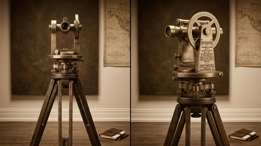
Good vintage editing begins with the original photograph rather than the preset. Check exposure and cropping before changing color. Fixing those basics first prevents the effect from hiding problems instead of improving the image.
Pay close attention to contrast. Excessive contrast can make dark brown areas look blocked and remove useful shadow detail. Too little contrast can leave the image flat and washed out.
A small amount of grain can support an older photographic style. Keep the texture subtle enough that faces and fine details remain readable. Heavy artificial grain often becomes the first thing viewers notice.
You can also add a light vignette around the frame. Darkening the edges can guide attention toward the main subject. Strong vignettes tend to look artificial, so use them with restraint.
Readers interested in related digital tools can browse SciTechWiz’s Software coverage. The site also maintains a broader Technology section for practical guides and explanations. These sections can help when your editing workflow involves different apps or devices.
Best Photos for a Warm Vintage Effect
Portraits are a natural starting point because warm monochrome colors reduce competing background hues. Expressions, eyes, clothing texture, and lighting become more prominent. Older family portraits can also gain a consistent appearance when collected into one album.
Architecture and street scenes work well for similar reasons. Brick, stone, wood, and metal often translate naturally into restrained brown tones. Older buildings can gain a convincing period atmosphere without complex editing.
Landscapes can work, but the subject matters. Scenes built around shape, mist, mountains, trees, or dramatic light usually translate better than colorful flowers. Removing vivid color should strengthen the composition rather than erase its main attraction.
Common Mistakes to Avoid
The most common mistake is assuming maximum intensity creates the most convincing result. Stronger processing can remove useful tonal variation and make the photograph appear artificially brown. A controlled effect usually looks more believable.
Another mistake is ignoring the original white balance. A photograph that already contains heavy yellow or orange coloring can become muddy. Correct obvious color problems before applying the final treatment.
Do not confuse toning with photo restoration. Changing colors cannot repair scratches, missing sections, blur, or severe fading. Restoration requires separate tools and careful editing.
Finally, avoid piling every vintage effect onto one image. Heavy grain, strong vignetting, faded contrast, scratches, and brown coloring can compete with each other. Pick only the adjustments that support the photograph’s purpose.
When Should You Use a Sepia Filter?
A sepia filter works best when the warm treatment supports the story behind the image. Family-history projects, retro posters, wedding designs, historical presentations, and nostalgic social posts are natural examples. The effect can connect separate photographs through a consistent visual style.
It is less useful when accurate color carries important information. Product photography, technical documentation, medical imagery, and color-comparison work usually need faithful color reproduction. In those situations, creative toning can make the image less informative.
Think about the viewer before applying any preset. Ask whether warmth and nostalgia improve the message or merely decorate the picture. That simple question prevents many overprocessed results.
Frequently Asked Questions About Sepia Photo Effects
What does a sepia filter do to a photo?
A sepia filter changes a photograph toward warm brown and tan shades associated with historic photographic prints. Digital versions alter pixel colors rather than performing a chemical darkroom process. Depending on intensity, some original color may remain visible.
Is sepia the same as black and white?
No, although both can create monochrome-style photographs. Black-and-white images use neutral gray tones, while the warm effect introduces brown coloration. That warmth usually creates a stronger nostalgic impression.
Can I make a photo look old without making it completely brown?
Yes, and subtle editing often produces a more convincing result. Use lower effect intensity and preserve part of the original color. Light grain or gentle contrast changes can add age without overpowering the subject.
Does the effect reduce photo quality?
The color effect itself does not necessarily reduce image dimensions. Export settings, compression, resizing, and repeated saving can affect final quality. Keep the original file and export an edited copy at suitable resolution.
What image format should I use after editing?
JPEG is practical for ordinary photographs and usually creates smaller files. PNG can be useful when lossless output or transparency matters. WebP can provide smaller web files when your publishing workflow supports it.
Get Better Results From Your Next Vintage Edit
Warm vintage toning works because it simplifies color while changing the photograph’s emotional character. The strongest result usually comes from thoughtful intensity, balanced contrast, and a suitable source image. Extra effects should support the subject instead of competing with it.
Start with a clean photograph and create one moderately toned version first. Compare it with both the original and a stronger variation. That quick comparison makes it easier to choose a natural-looking result rather than accepting a preset automatically.
For more practical guides covering software, devices, and everyday digital tasks, continue exploring SciTechWiz. Its technology and how-to coverage can help you build a simpler editing workflow. Keep the original photo safe so you can experiment without losing your starting point.